
1/28/2013 Portland, Oregon – Pop in your mints…
With Japan’s recent aggressive devaluation of the Yen, the financial news has again taken up the phrase “currency war” to describe any lack of coordination in the steady devaluation of fiat currencies across the globe.
In a recent piece over at the Financial Times, Niall Ferguson identifies the Bank of England as the current winner in the stealth currency war that is currently being waged. While the Bank of England may be the winner, the losers are not other nations, as the term war would suggest, but rather the savings of those who are unfortunate to count bank accounts or debt instruments denominated in national currencies among their assets.
Who, then, are the winners in what we have dubbed the currency war to end all currency wars? In a simplified sense, those who hold the Dow Jones Industrial stock index (not the individual stocks, which are, in the final analysis, a crap shoot) and those who own gold.
In an attempt to illustrate this point while at the same time saving 1,000 words, should the old adage hold true, we have created the following graph, which plots a normalization (which brings the sheer magnitude of the numbers down to a workable scale) of the M1 and M2 monetary measures against both the Dow Jones Industrial Average and gold prices, all averaged on a monthly basis since April of 1968.
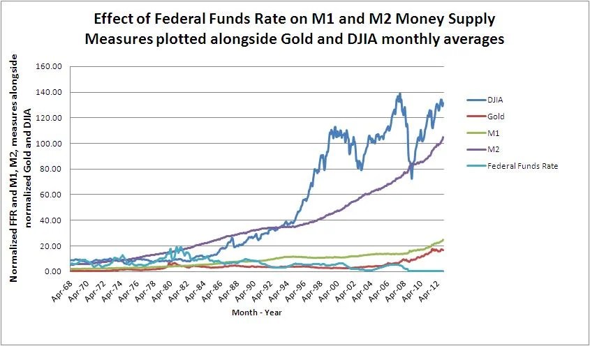
Those with a keen eye will notice that the only data point that has been on a downward trend since the US Dollar was officially released from the shackles of the gold standard on August 15, 1971 has been the Federal Funds Rate, which in theory should have an inverse relationship with all of the other data points.
We will leave you with three observations from our graphic exercise:
1. The most volatile of the two asset data sets has been that of the Dow Jones Industrial Average. However, despite its volatility, its overall trend tends to follow that of the M2, or expanded, money supply measure.
2. The more stable of the two asset data sets has been gold, which has generally lagged growth in the M1, or base money supply to which it was tied to pre 1971. Beginning in the year 2000, gold again began to follow the M1 trend.
3. The light blue line, which tracks the Federal Funds Rate, has been on a downtrend. The upticks in the Federal Funds Rate, in theory, should have lead to downward ticks in the M1 and M2 As you can see from the graph, this is not the case.
The conclusion of this brief analysis is the following: Holding Stock Indices such as the Dow Jones should give some measure of protection against inflation over the long term, perhaps even superior to gold. However, since 2000, gold has held steady as an inflation hedge and generally will have less liquidity risk than stocks.
Finally, and perhaps most importantly, is that upwards changes in the Federal Funds rate, even those as dramatic as were experienced during the Volcker years, have little or no effect on the near term trajectory of the M1 and M2 monetary measures and have never caused these monetary measures to trend downwards, ever. At most, these movements may serve to temporarily arrest the upwards slope of the growth of the M1 and M2 monetary measures.
What does it mean? While the Federal Funds Rate may serve to weakly toggle the rise in the M1 and M2 measures, the Quantitative easing programs, which began in 2008 and are now a permanent piece of monetary policy, have had a much greater direct impact on both the monetary measures and the asset classes which have been included above.
Given the current state of affairs, the QE program must be watched closely as it will have an outsized immediate impact on asset prices.
In the long run, it is clear that the Federal Reserve has set monetary policy on autopilot and programmed a course straight through the stratosphere and into the far reaches of outer space. There is no plan for the US Dollar to return to earth. The M1 and M2 monetary measures will not come down, no matter what happens to QE and the Federal Funds Rate.
It is time to organize investments in the real world accordingly.
Stay tuned and Trust Jesus.
Stay Fresh!
Email: davidminteconomics@gmail.com
Key Indicators for January 28 2013
Copper Price per Lb: $3.64
Oil Price per Barrel: $96.52
Corn Price per Bushel: $7.29
10 Yr US Treasury Bond: 1.97%
FED Target Rate: 0.15% ON AUTOPILOT, THE FED IS DEAD!
Gold Price Per Ounce: $1,659 THE GOLD RUSH IS ON!
MINT Perceived Target Rate*: 0.25%
Unemployment Rate: 7.8%
Inflation Rate (CPI): 0.0%
Dow Jones Industrial Average: 13,881
M1 Monetary Base: $2,397,900,000,000 LOTS OF DOUGH ON THE STREET!
M2 Monetary Base: $10,501,100,000,000


You must be logged in to post a comment.