Tag Archives: Money Supply Measures

The Mint Money Supply Digest for June 17, 2013

6/17/2013 Portland, Oregon – Pop in your mints…

Over the past week the M1 money supply has come roaring back from its relative collapse over the prior two weeks.  Today, the measure sits at $2.6 trillion.

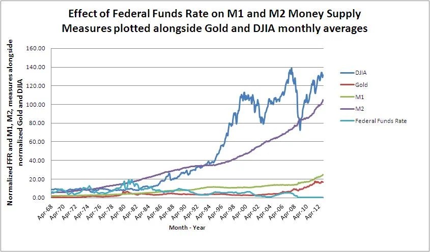
For the uninitiated, the M1 and M2 Money supply measures, published on a weekly basis by the Federal Reserve, are defined as the following:

M1 consists of (1) currency outside the U.S. Treasury, Federal Reserve Banks, and the vaults of depository institutions; (2) traveler’s checks of nonbank issuers; (3) demand deposits at commercial banks (excluding those amounts held by depository institutions, the U.S. government, and foreign banks and official institutions) less cash items in the process of collection and Federal Reserve float; and (4) other checkable deposits (OCDs), consisting of negotiable order of withdrawal (NOW) and automatic transfer service (ATS) accounts at depository institutions, credit union share draft accounts, and demand deposits at thrift institutions. Seasonally adjusted M1 is constructed by summing currency, traveler’s checks, demand deposits, and OCDs, each seasonally adjusted separately.

M2 consists of M1 plus (1) savings deposits (including money market deposit accounts); (2) small-denomination time deposits (time deposits in amounts of less than $100,000), less individual retirement account (IRA) and Keogh balances at depository institutions; and (3) balances in retail money market mutual funds, less IRA and Keogh balances at money market mutual funds. Seasonally adjusted M2 is constructed by summing savings deposits, small-denomination time deposits, and retail money funds, each seasonally adjusted separately, and adding this result to seasonally adjusted M1.

In layman’s terms, the M1 Money supply is what we refer to as “Money on the street,” or cold hard cash.  It is the part of the money supply that is otherwise unencumbered or loaned out on float.

The M2 Money supply is perhaps best defined as the Money on the street (M1) plus all of the money that customers think is held at banks but is really loaned out.

In the past, the Federal Reserve also published the M3 (Broad) Money supply measure, which was essentially all of the money that customers had, thought they had, and/or thought that they could receive (via the inclusion of money market funds and repo instruments).  It was perhaps the truest measure of the money circulating in an economy  in aggregate.  In addition to base money, demand deposits, and time deposits, M3 included what the largest treasuries were holding in quasi money instruments . The Federal Reserve stopped publishing the measure on  March 23, 2006 as it began to launch into the stratosphere.

While the Broad money supply (M3) may have crossed the line into credit instruments {Editor’s Note:  Here at The Mint we recognize all Central Bank notes as credit instruments by definition}, it was an excellent proxy for inflation, for it gave demonstrated the sum total of how many players were participating in the game of monetary musical chairs that the banks and large treasuries play every evening when they settle up.

The M2/M1 Ratio

Today, we submit for your perusal, a graphic of the M2 Money supply divided by the M1 Money supply (the M2/M1 Ratio) by month for the data sets since January 1, 1959, the first year that the data is easily retrievable, through the first week of June.

Historical Ratio of M2 / M1 Money Supply Measures

For purposes of interpretation, the chart shows the degree to which the M1 Money supply is “leveraged” by commercial banks to create what is reported in the M2 figures.  Bear in mind this ratio is a function of both bank reserve requirements and consumer behavior.  Generally speaking, the M1 and M2 Money supply measures have been increasing over the span of the chart.

The ratio between them, however, has been on a general increase as well, meaning that the M1 measure has been leveraged.  This leverage appears to have peaked around 5.4 during the meltdown of late 2008 and early 2009.  Ever since then, it has been on a steady decline and currently stands at 4, just a shade above the straight average of 3.7 for the entire data set.

At a glance, it would appear that the economy, in terms of the M2/M1 ratio, is returning to a healthy balance.  In practice, this means that the game of musical chairs that occurs at the Fed settlement each night is a bit less stressful for the participants.

Unfortunately, this ratio appears to be historical with little predictive value save that perhaps a ratio of 5/1 being an indication that the monetary base is overextended.

For the moment, with the downward trend in the ratio intact, it appears that the monetary base that the Federal Reserve has gone to great pains to pad via its QE programs, is intact and ready to support an increase in economic activity.  Howver, one must keep in the back of their mind that the money supply itself is fragile, and if confidence in the Fed were to evaporate, all bets are off.

Stay tuned and Trust Jesus.

Stay Fresh!

David Mint

Email: davidminteconomics@gmail.com

Key Indicators for June 17, 2013

Copper Price per Lb: $3.19
Oil Price per Barrel:  $97.78
Corn Price per Bushel:  $6.68
10 Yr US Treasury Bond:  2.17%
Mt Gox Bitcoin price in US:  $106.99
FED Target Rate:  0.09%  ON AUTOPILOT, THE FED IS DEAD!
Gold Price Per Ounce:  $1,385 THE GOLD RUSH IS ON HOLD FOR THE SUMMER!
MINT Perceived Target Rate*:  0.25%
Unemployment Rate:  7.6%
Inflation Rate (CPI):  -0.4%
Dow Jones Industrial Average:  15,180
M1 Monetary Base:  $2,634,300,000,000
M2 Monetary Base:  $10,586,200,000,000

The Debut of The Mint Money Supply Digest

5/3/2013 Portland, Oregon – Pop in your mints…

Today at The Mint we are launching The Mint Money Supply Digest.  Longsuffering readers of The Mint will recall that we launched a now defunct service known as the “72 Hour Call” which was an attempt to predict the future direction of a specific trade three days out.  After roughly 63 attempts, of which we were batting .524 (correct 52.4% of the time) we decided that the short term call was a fool’s game best left to high frequency traders and those with insider information.

However, the 72 Hour Call exercise was not in vain, rather, what it revealed was that while our Key Indicators (listed below), when taken together, revealed no reliable and/or actionable data with regards to short term trades.  Over time, however, the Key Indicators have proven extremely helpful in projecting longer term trends which tend to underpin the S&P 500 in particular and US equity indices in general.

Before we go further, we must give credit to both Lee Adler at the Wall Street Examiner and Greg Guenther of the Daily Reckoning’s Rude Awakening for their brilliant coverage of the frequent gyrations in the financial markets.  If you need information which is actionable on a shorter time horizon, we highly recommend following their insights.

The intent of The Mint Money Supply Digest is to provide insight via the observation of changes in the trend of our Key Indicators as to the direction of one simple yet critically important trend.

The simple trend is that of the money supply in terms of US dollars.  The goal of the monetary stimulus every central bank on the planet has undertaken to some degree or another over the past three to four years has been to simply increase the money supply and hope for the best.

Graph of Normalized DJIA and Gold assets classes vs. M1, M2, and Federal Funds Rate measures
Graph of normalized DJIA and Gold assets classes vs. M1, M2, and Federal Funds Rate measures

The strategy is a recipe for disaster, as we have explored in depth both here at The Mint and in our eBook series “Why what we use as Money Matters.”  The goal of The Mint Money Supply Digest is to keep our readers informed as to the trend of the Money Supply in terms of US dollars in an effort to keep you ahead of the curve when the disasters (for there will be a series of them) occur.

The disasters will come in one of two flavors.  The first flavor, which we will call vanilla for the moment, takes the form of the increases in the money supply begin to take hold to the point where inflationary expectations by a majority of the actors in the world economy who use dollars or dollar proxies (currencies and debt instruments which are pegged, directly or indirectly, to the US dollar) in trade become embedded to the point where inflation in consumer prices sparks a level of demand in consumer goods which quickly outstrips supplies of such goods.  The vanilla disaster is a mouthful, and it is where the trend is gently heading today.

The second flavor, the disaster which is unlikely in the short term save the appearance of black swan type events, we will call the chocolate variety.  The chocolate variety of disaster is simple, it takes the form of an unmitigated collapse in the money supply similar to what the world experienced in 2007 (which most people realized was occurring in 2008).  Were this to occur, it is time to get all chips off of the table.  Fortunately, our Key Indicators should give us roughly three to four years of advance warning of a full blow chocolate disaster taking place (barring the unpredictable, or black swan event, as it were).

As you can see, while the chocolate disaster is to be feared above all, it will be easier to prepare for given the lead time in the data.  The vanilla disaster, which is currently underway to some extent, will be somewhat more difficult to pinpoint in terms of timing but will likely have a lead time of roughly two to three months in which to take action.

Our bias, then, at the outset of The Mint Money Supply Digest, is to be on the lookout for the vanilla disaster while gauging, via the trends in our Key Indicators, just how much chocolate is mixed into the swirl which is the combined disaster that is slowly unfolding in US dollar land.

As a logical offshoot of our analysis, we keep an eye on something we call the “Monetary Premium,” which is our term for what most people simply refer to as money.  In our worldview, money does not exist in the tangible way that most people assume it does.  Rather, the concept of money comes into being when people begin to attach the attributes of money to something which gives that something (usually one of our Key Indicators) a premium above and beyond what normal market conditions and that special “something’s” physical or ethereal composition might otherwise dictate.

This increase in relative value of that special “something” is what we refer to as the Monetary Premium, and it is important, for a big part of making money is accurately identifying not where the monetary premium is, such as the US dollar, but in where it is gravitating towards, such as gold, Bitcoins, or sea shells.

With the preamble out of the way, we hope to keep the Digests as simple and sweet as a cone on a hot summer’s day.

The Mint Money Supply Digest for May 3, 2013

Today the swirl of disasters continues to tend towards the vanilla variety.  Jobless claims continued their positive trend and the unemployment rate reported by the BLS came down a notch to 7.5%.  This is good news and bad news.  Good news in that more people have jobs, and bad news in that every tick down in Unemployment moves the world closer to the day where the Federal Reserve is likely to turn the switch on their monetary Mega maid, their Quantitative easing programs, from suck to blow.  That day is still far off, however.

Today’s jobs report, coupled with the ECB’s dovish meeting announcements yesterday (they are throwing in the towel, albeit in slow motion, on austerity) and the BOJ’s Turbo Kids monetary strategy for an aging population are all buoying the money supply to counteract the unmitigated, innavigable disaster that is the world economy.  An economy that is desperately trying to reset itself without the benefit of knowing who is really solvent.

The vanilla disaster is still winning.

Stay tuned and Trust Jesus.

Stay Fresh!

David Mint

Email: davidminteconomics@gmail.com

Key Indicators for May 3, 2013

Copper Price per Lb: $3.28
Oil Price per Barrel:  $95.68
Corn Price per Bushel:  $6.99
10 Yr US Treasury Bond:  1.73%
Mt Gox Bitcoin price in US:  $91.78
FED Target Rate:  0.14%  ON AUTOPILOT, THE FED IS DEAD!
Gold Price Per Ounce:  $1,468 THE GOLD RUSH IS STILL ON!
MINT Perceived Target Rate*:  0.25%
Unemployment Rate:  7.5%
Inflation Rate (CPI):  -0.2%
Dow Jones Industrial Average:  14,987
M1 Monetary Base:  $2,565,500,000,000 LOTS OF DOUGH ON THE STREET!
M2 Monetary Base:  $10,571,400,000,000

The Inflation Mega Trend/Commodity Super Cycle is alive and well

10/19/2012 Portland, Oregon – Pop in your mints…

At the bottom of every Mint, we include a handy set of data which we consider so important that we have named the compilation ‘Key Indicators.”  Taken apart, they are just numbers.  They are neither good not bad, they are simply data points.

Taken together, they tell a story.  The story of The Mint’s Key Indicators is one of what Nadeem Walayat, over at the Market Oracle, refers to as the “Inflation Mega-Trend.”  The phenomenon, in other corners, has been referred to as the “Commodity Super Cycle,” and other superlatives.

The driving factor behind the narrative is that the monetary authorities across the globe are in the process of causing inflation, via direct electronic money printing and intervening in debt markets to create the illusion of low borrowing rates, on a scale once thought impossible.

What makes their inflationary actions all the more sinister is that they are continually trumpeted in the media as necessary due to fears of deflation.

The Inflation Mega Trend, if it indeed is intact, has serious implications for investment strategies.  First and foremost, fixed income is dead.  Most governmental and institutional debt instruments are issued today at negative real interest rates, meaning that those purchasing them are agreeing, up front, to a loss in purchasing power of the funds.

The classic way to invest in this environment, has been to purchase precious metals, other hard commodities, real estate, and, as one analyst put it, “plastic silverware, toilet paper, really anything real.”  Equities have also been a good place to invest as long as the trend is intact, preferably those stocks which are components of the indices which are targeted to rise by the monetary authorities, such as the Dow Jones and S&P 500.

If one is following this investment strategy, the question that must be asked, day after day, year after year, is the following:

Is the Inflation Mega Trend still in place?

The Mint’s Key Indicators are presented to respond to this question.  The following is a table which compares each Key Indicator to its level on the same day during the past two years, along with a one word interpretation as to what the annual change in the indicator is telling us:

The Mint's Key Indicators on October 19
The Mint’s Key Indicators on October 19

What is striking about this graphic is that, of the three indicators which do not indicate that inflation is continuing, two are, at this point, directly controlled by the Federal Reserve’s actions, the 10yr US Treasury Yield and the FED Target Rate.

Folks, despite deflationary propaganda to the contrary, the Inflation Mega Trend is alive and well.  Don’t believe the hype and invest accordingly.

Stay tuned and Trust Jesus.

Stay Fresh!

David Mint

Email: davidminteconomics@gmail.com

Key Indicators for October 19, 2012

Copper Price per Lb: $3.71
Oil Price per Barrel:  $92.03
Corn Price per Bushel:  $7.60
10 Yr US Treasury Bond:  1.83%
FED Target Rate:  0.15%  ON AUTOPILOT, THE FED IS DEAD!
Gold Price Per Ounce:  $1,742 PERMANENT UNCERTAINTY
MINT Perceived Target Rate*:  0.25%
Unemployment Rate:  7.8%
Inflation Rate (CPI):  0.6%
Dow Jones Industrial Average:  13,549
M1 Monetary Base:  $2,334,000,000,000
M2 Monetary Base:  $10,199,400,000,000